Challenge
Sam’s Club MAP was growing fast, but needed a name that made its key benefits easier for advertisers to understand, and a visual identity that worked with the Sam’s Club rebrand.
Insight
Advertisers already knew us for our members, and they are under constant pressure to prove their spend works. Membership gives Sam’s Club something few networks have: rich member data and experiences that show real results.
Idea
Sam’s Club Connect. A simple, memorable name, a value proposition built on breakthrough experiences, proof of impact, and member data, and a new tagline: Turn membership into momentum.
Role
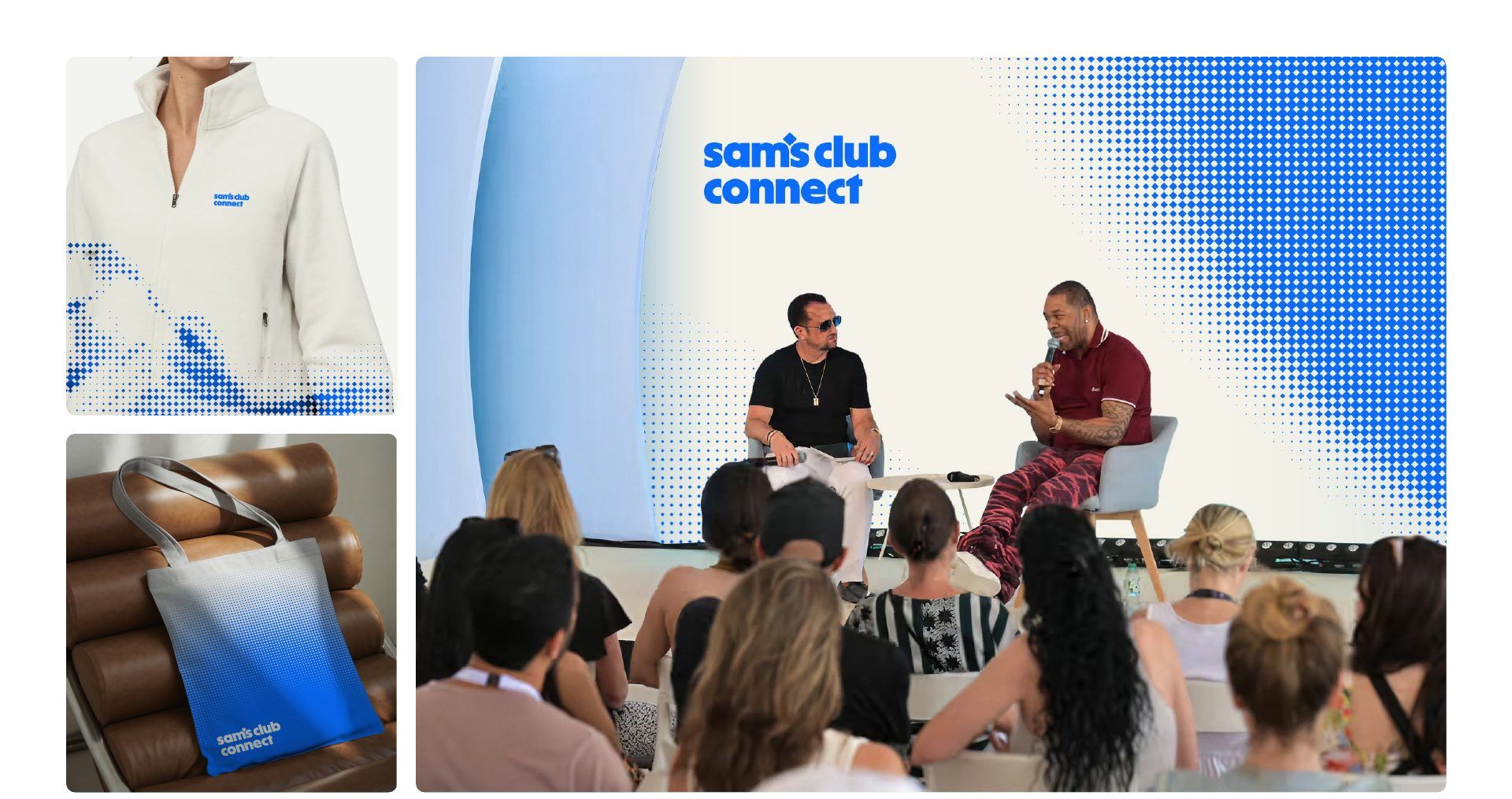
Head of Brand. Led naming, positioning, identity, and voice with agency partners Turner Duckworth and Publicis Groupe, and the launch in June 2026, timed to Cannes.
A design system built on the Sam’s Club brand
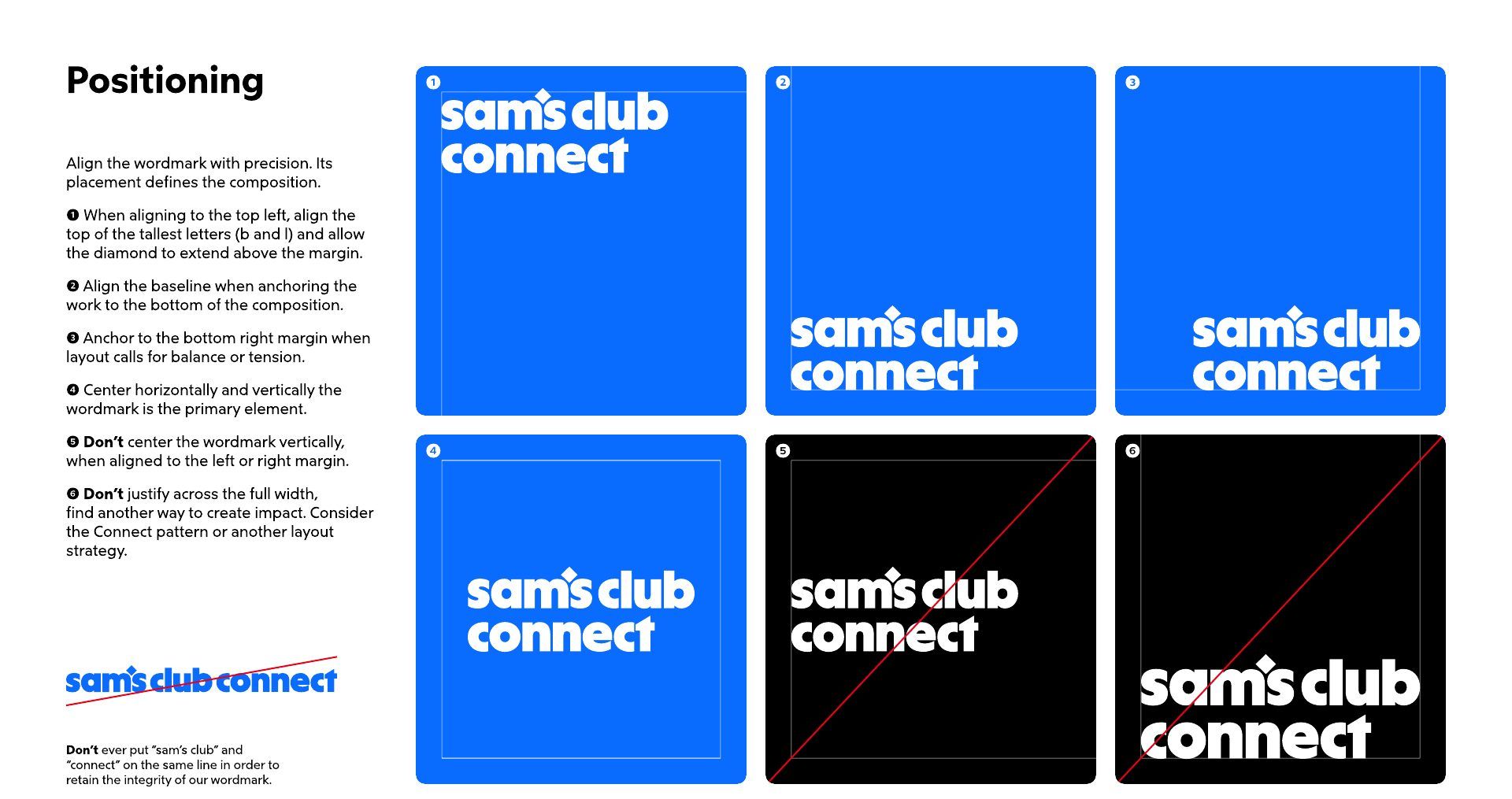
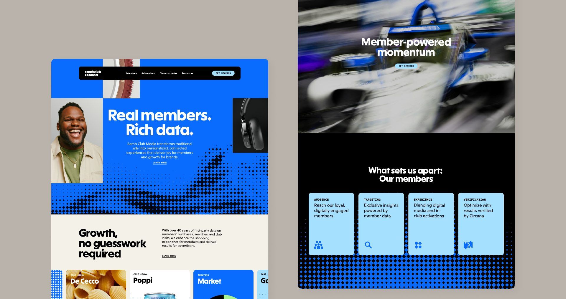
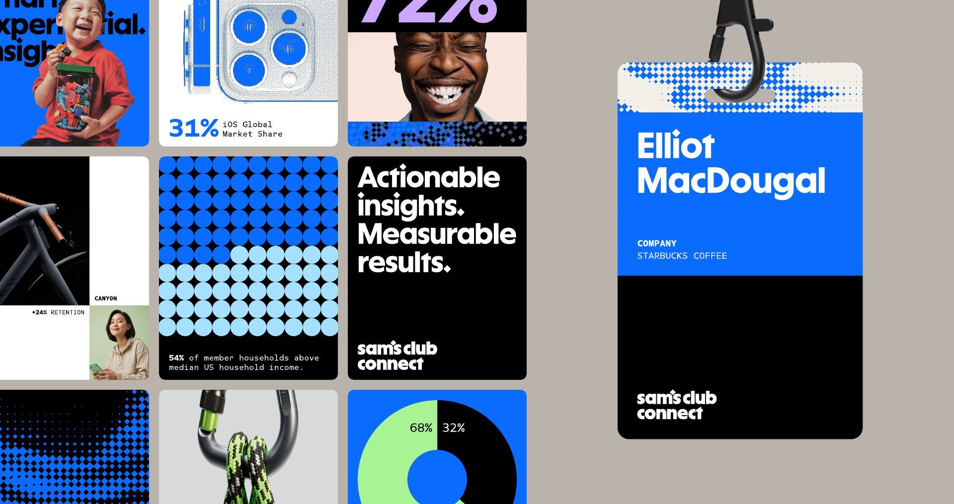
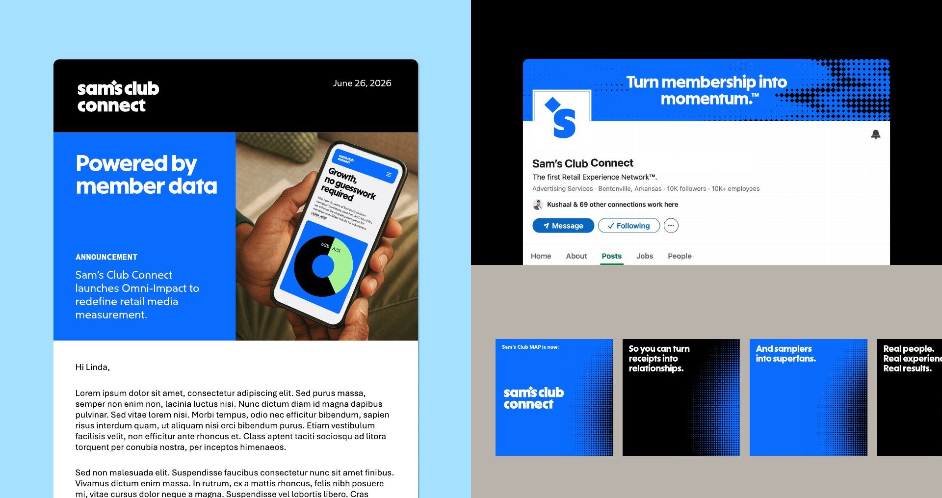
The identity borrows the parent brand’s wordmark and blue, then adds a system of its own for a business-to-business audience.
Color and type
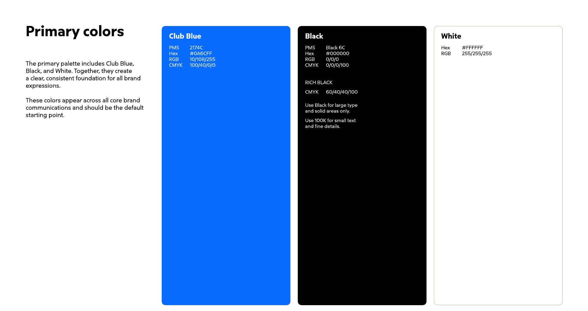
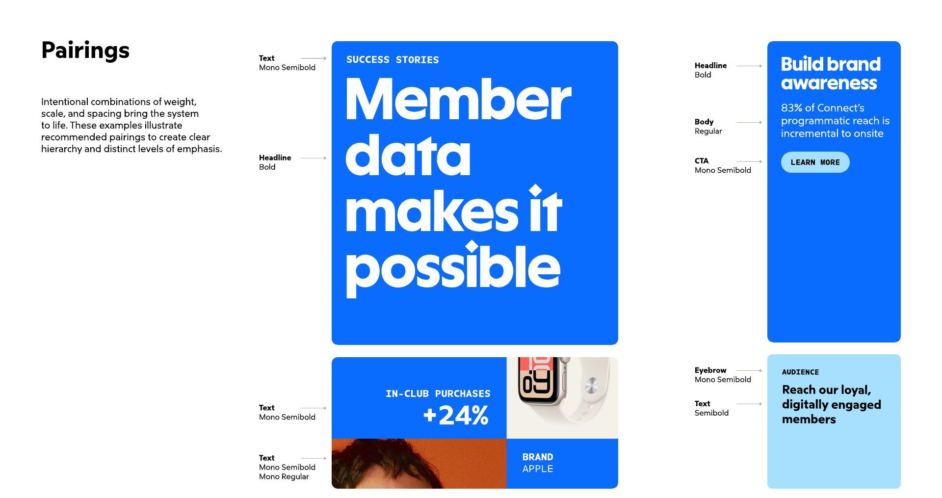
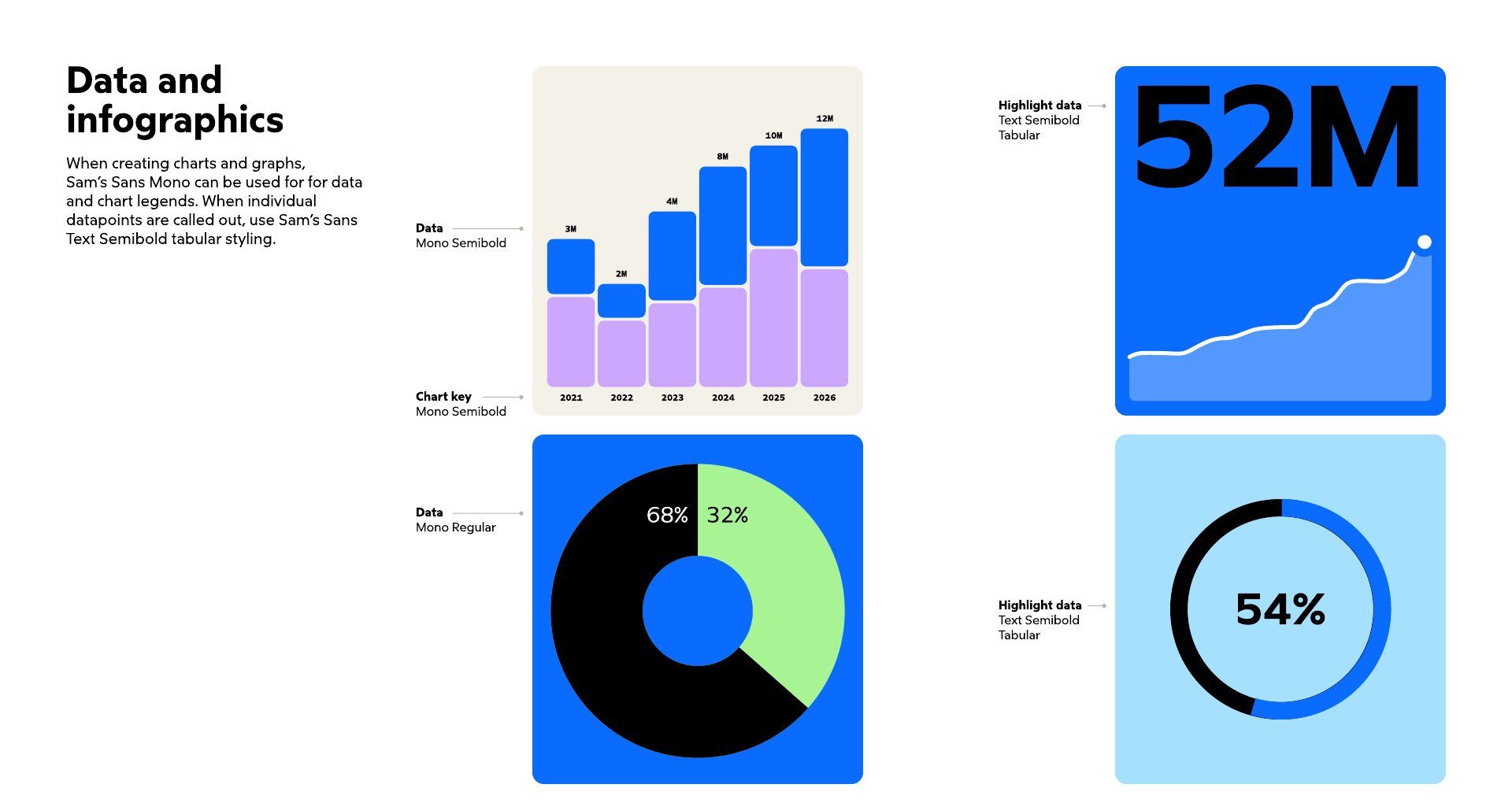
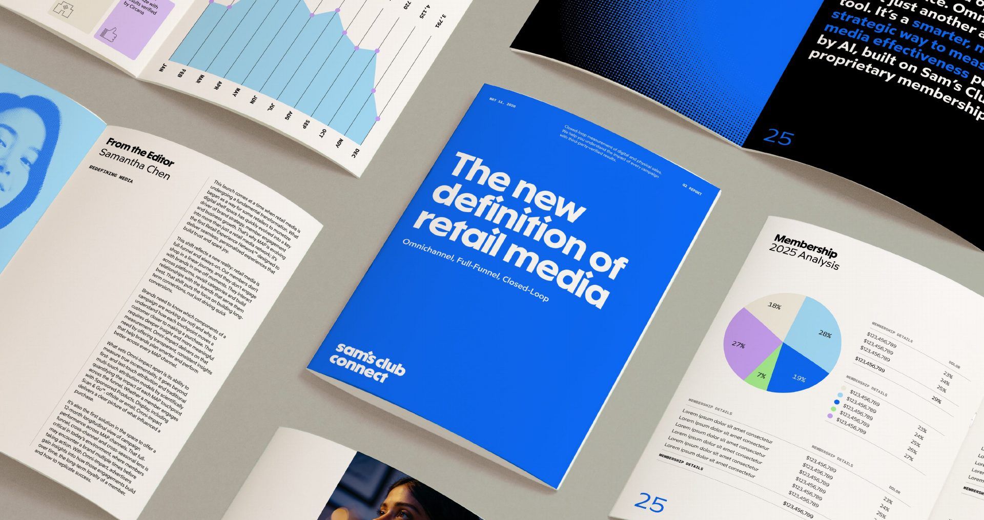
A focused palette led by Sam’s Club blue, with supporting tones for data and infographics, set in the brand’s proprietary type family.
The Connect pattern
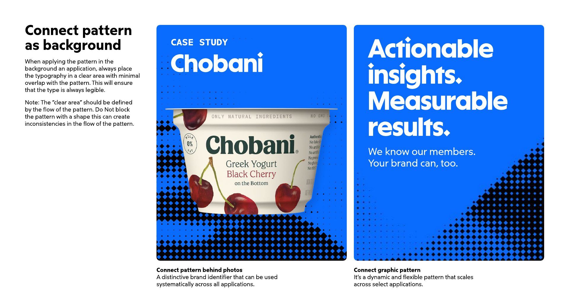
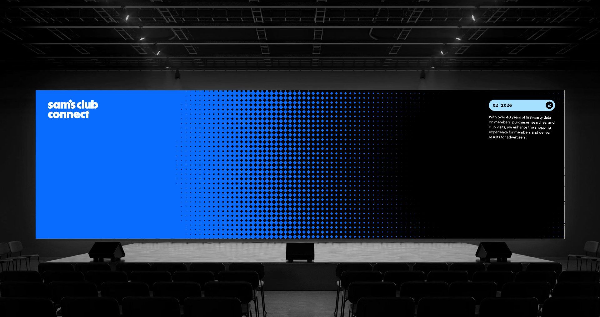
A diamond-based halftone that represents the connections between brand, members, and the communities they serve. It doubles as a visual for the rich data behind the network.
Imagery and icons
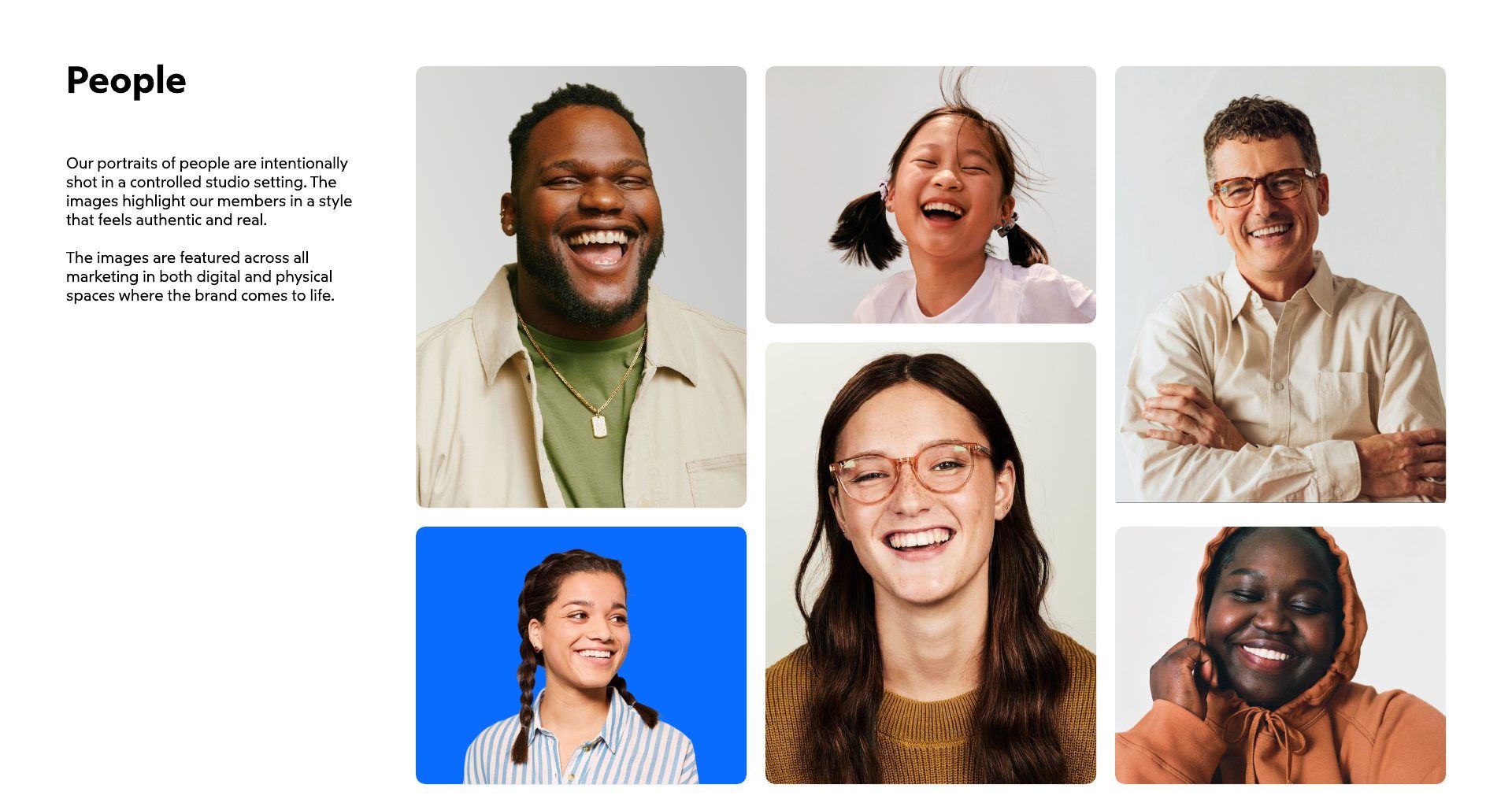
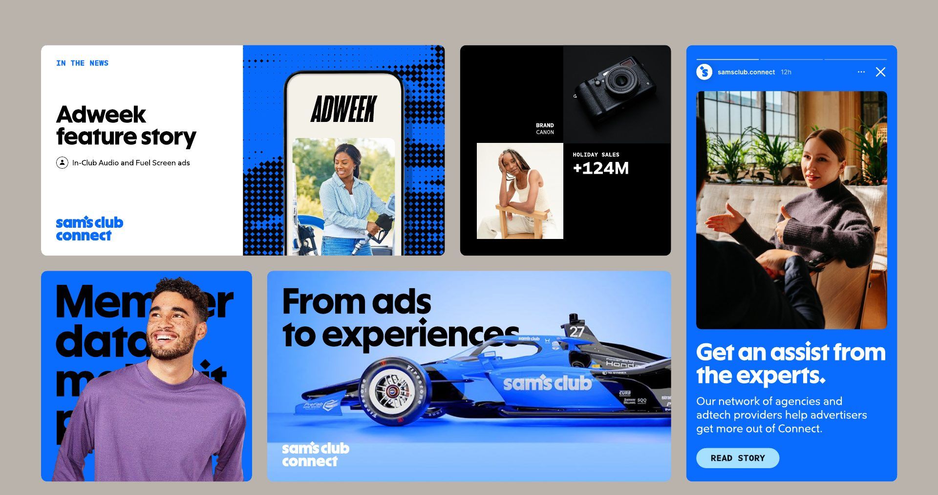
Real members, engaging activations, and thoughtfully curated products, plus a functional icon set shared with the master brand.
A new voice
Less B2B, more human. The voice guidelines ask writers to sound bold, vibrant, and genuine.
In market
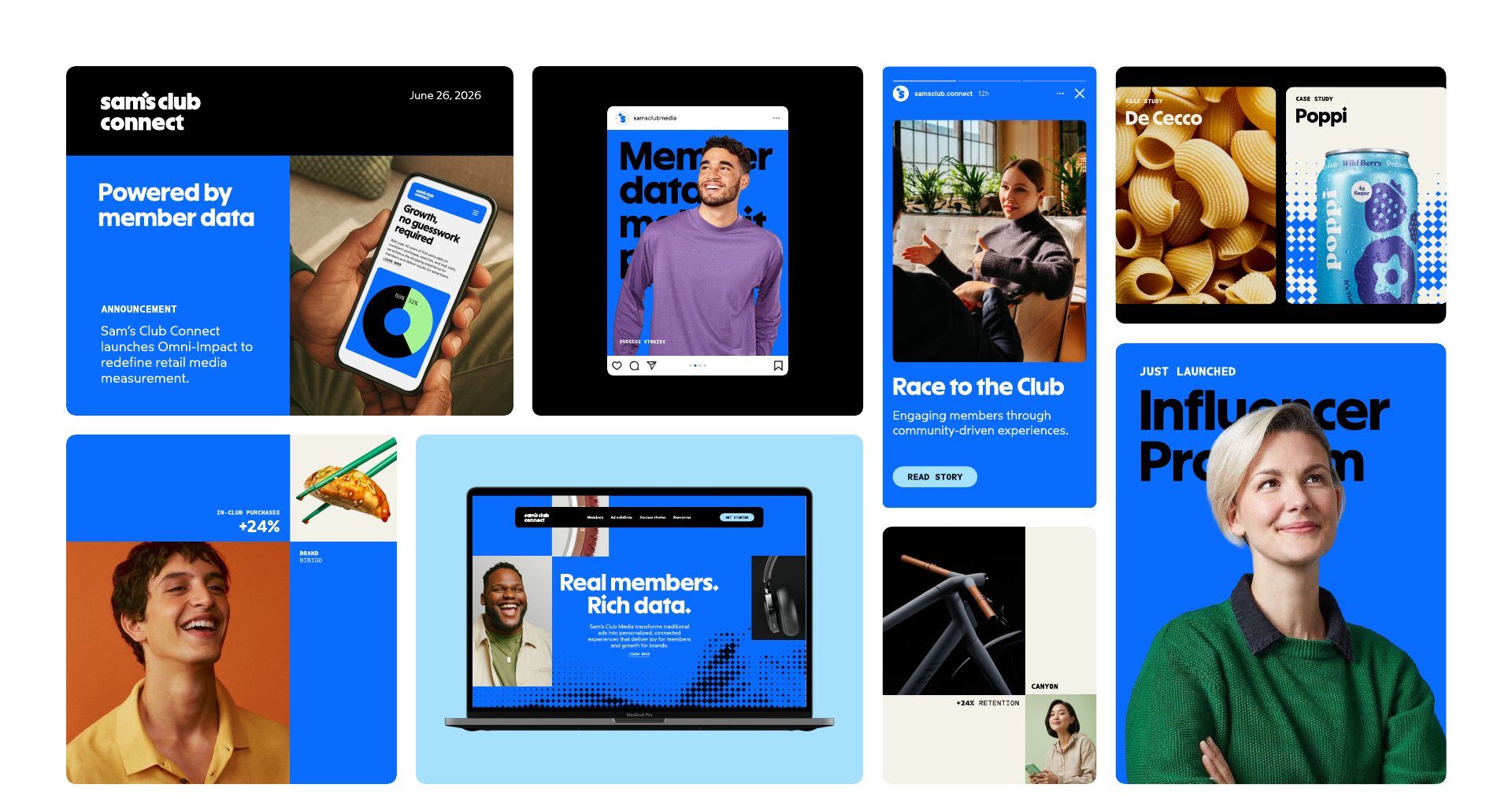
Website, social, paid media, sales materials, and the Cannes suite, all launched together.
Identity developed with Turner Duckworth. Launch campaign with Publicis Groupe.